Studies conducted by the Pew Research Center showed nearly two-thirds of U.S. adults say fabricated news cause confusion about the basic facts of current issues and events.
The Pew Research Center showed that among people between the ages of 18-29, social media was the most popular way to get news. However, just 5% of U.S. adults have a lot of trust in the information they get from social media.
As the new generation of voters become of age, I wanted to ensure they are informed readers instead of believing everything they read online. As the new generation of voters become of age, how can we design a news publication that encourages readers to question what they read instead of taking it at face value?

DURATION
Mar. 2019
MY ROLE
Visual Design Brand Identity Motion Design

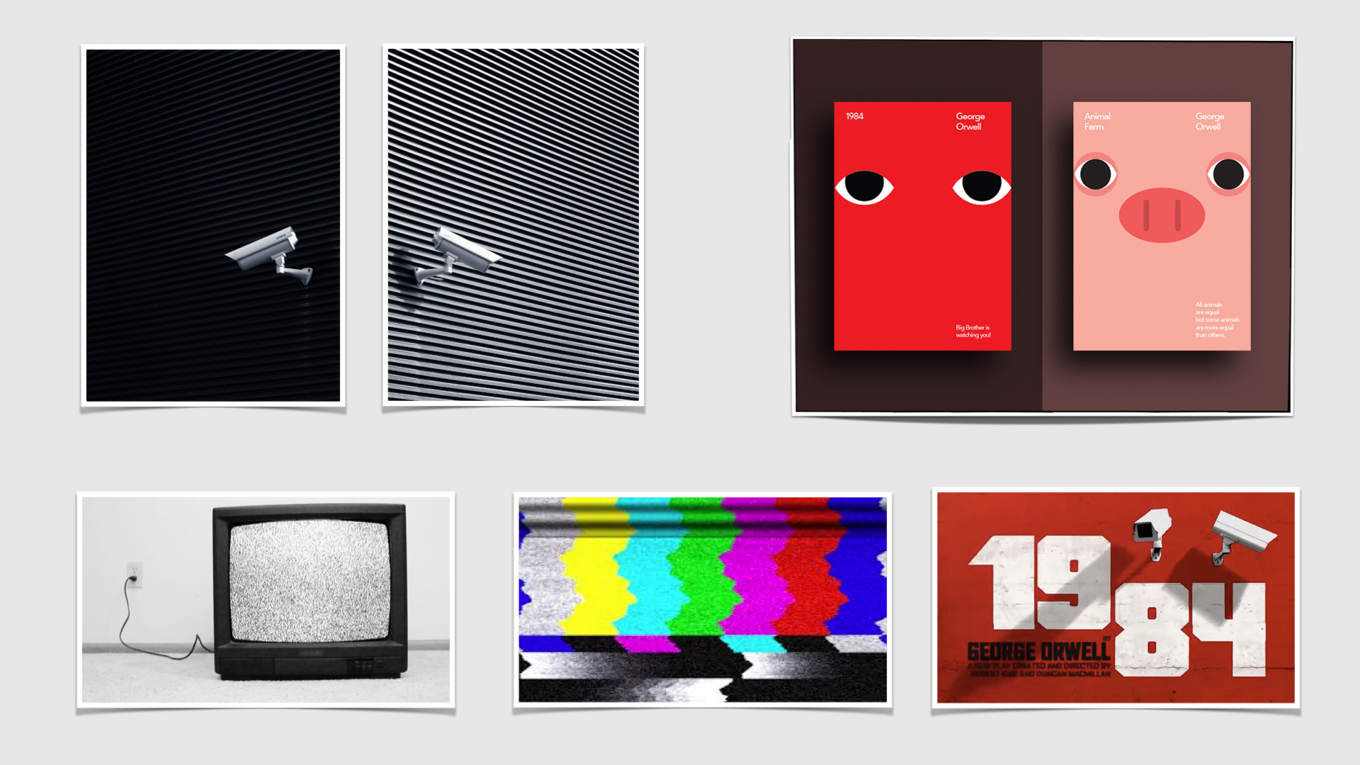
Inspired by George Orwell's 1984, I based 'The Skeptic' publication art direction on the dystopia presented in 1984.
Orwell presents a dystopian society, where individuals can only truly speak their minds when Big Brother isn't watching over them. Similar to Orwell's dystopian society, I wanted to present an online publication that readers can rely on for obtaining authentic news free from any external censorship and manipulation.
I chose 'The Skeptic' as the publication's name to remind readers to question everything they read, and challenge them to become aware of false news online and carry out their own fact checks.

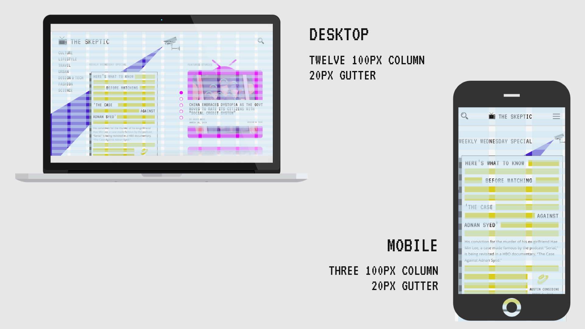
To create an engaging online experience, I used a twelve column grid, the fonts VT323 and Open Sans, and a color palette that reflects the dystopian era presented in 1984.
I used a twelve 100px column grid with a 20px gutter to structure the publication's content on the desktop designs, and a three 100px column grid with a 20px gutter for the mobile designs.
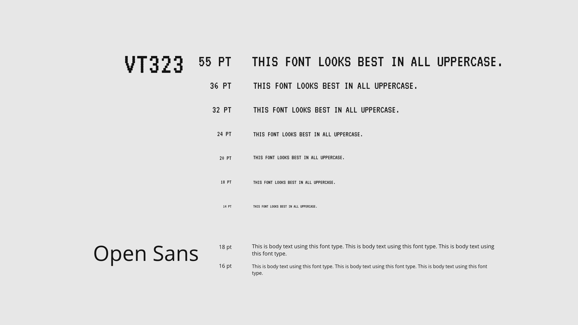
I selected two font typefaces, VT323 and Open Sans. VT323 is a 2D-pixel font that reflects how text appeared on old television sets and was used primarily for headings, emphasis (quotes and lead-in copy) and text within the television asset (publication date, story genre and author.) It is also only used in uppercase since it is difficult to read otherwise. Open Sans is a simple and easy to read font that is used for the story's body text.
The color palette I selected for 'The Skeptic' pays tribute to Orwell's 1984. The palette reflects the colorful signal interference screen on old television sets, indicating true news can be shared and discussed because Big Brother is undergoing external interference.
I used a twelve 100px column grid with a 20px gutter to structure the publication's content on the desktop designs, and a three 100px column grid with a 20px gutter for the mobile designs.
I selected two font typefaces, VT323 and Open Sans. VT323 is a 2D-pixel font that reflects how text appeared on old television sets and was used primarily for headings, emphasis (quotes and lead-in copy) and text within the television asset (publication date, story genre and author.) It is also only used in uppercase since it is difficult to read otherwise. Open Sans is a simple and easy to read font that is used for the story's body text.
The color palette I selected for 'The Skeptic' pays tribute to Orwell's 1984. The palette reflects the colorful signal interference screen on old television sets, indicating true news can be shared and discussed because Big Brother is undergoing external interference.
A potential reader could discover the publication through their Facebook newsfeed by seeing a shared news story from 'The Skeptic'.
The vivid colors of the story's cover image, along with an untraditional font type are geared towards piquing the user's curiosity, and encourages them to click on the post. Upon clicking on the post, the user is redirected to the story page on 'The Skeptic.
The vivid colors of the story's cover image, along with an untraditional font type are geared towards piquing the user's curiosity, and encourages them to click on the post. Upon clicking on the post, the user is redirected to the story page on 'The Skeptic.

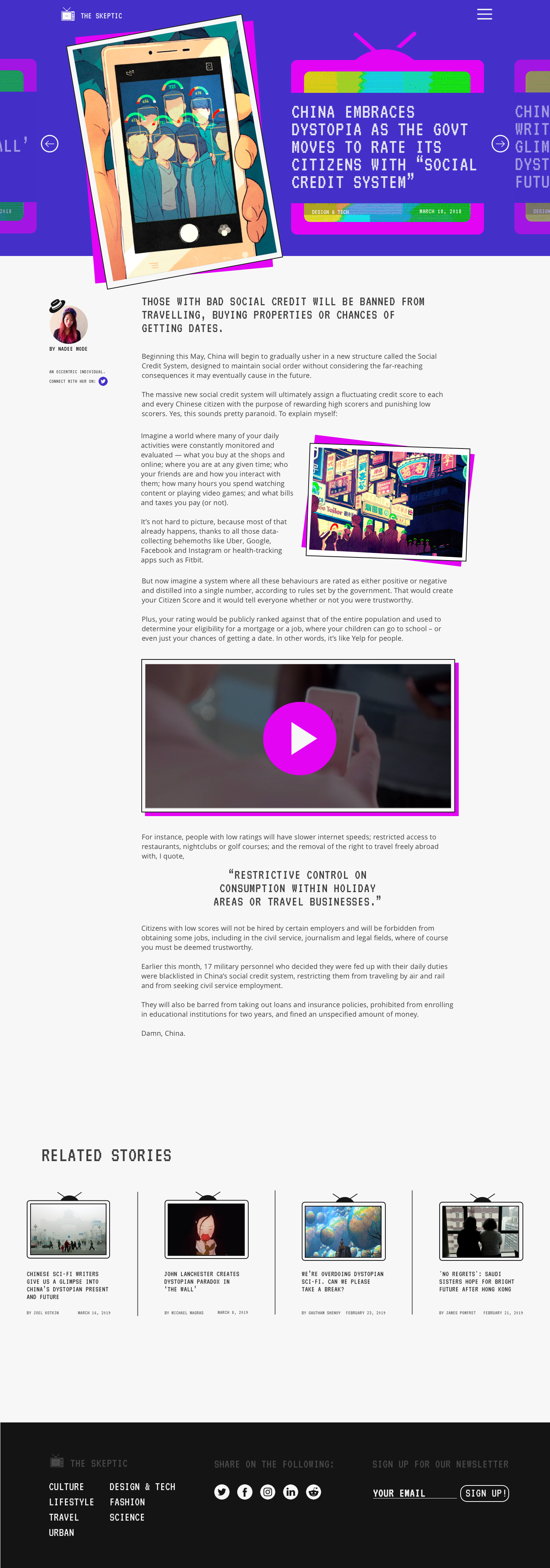
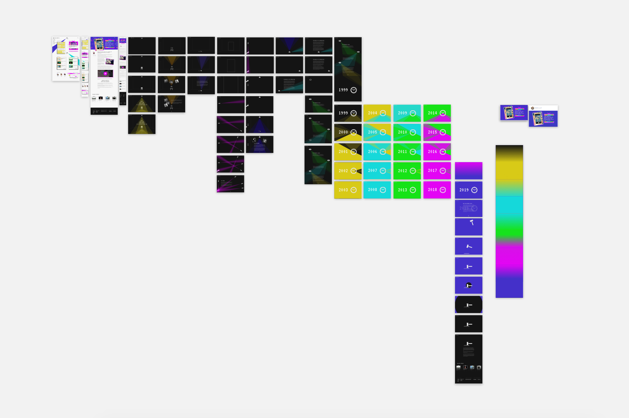
'The Skeptic' contains two news story types, one of which is the general news stories that are published on a daily basis in batches of 4-5 stories.
The general news story page layout is generically designed to be applicable to any story type, but it's also designed to stand out from other competing online news publications with 'The Skeptic' unique color palette, and introducing the article through image assets like the 90s television set and polaroid photo.
The general news story page layout is generically designed to be applicable to any story type, but it's also designed to stand out from other competing online news publications with 'The Skeptic' unique color palette, and introducing the article through image assets like the 90s television set and polaroid photo.

'The Skeptic' has a special weekly interactive story that is designed separately from the general news stories.
The weekly special stories are designed as short-animated movies that immerse the user through transitional visuals and cues, and clean solid lines and colors.
The weekly special stories are designed as short-animated movies that immerse the user through transitional visuals and cues, and clean solid lines and colors.
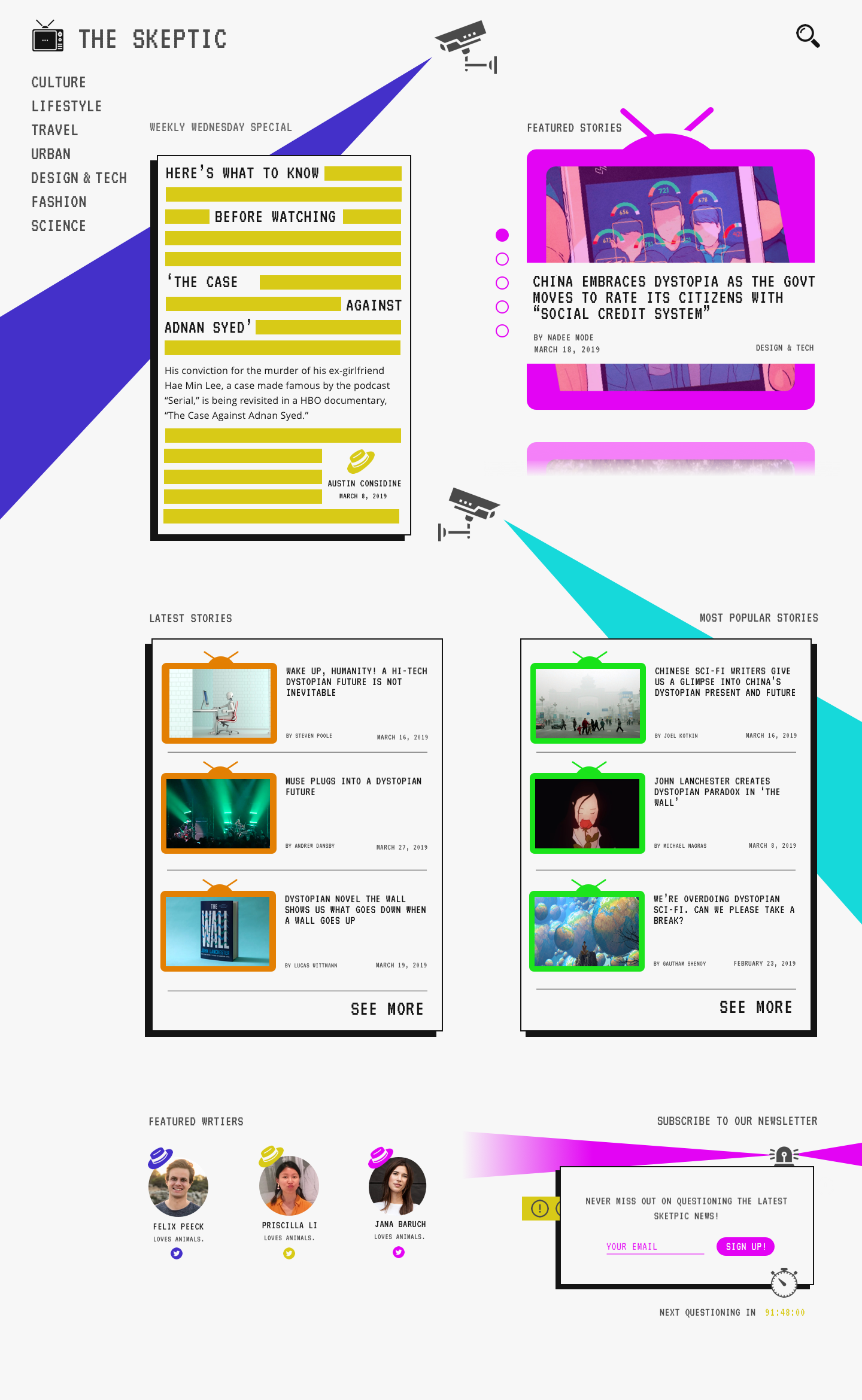
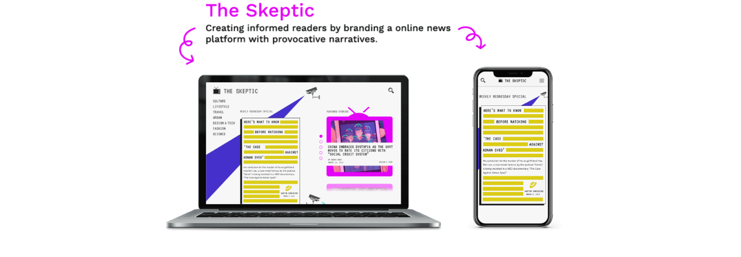
The homepage of 'The Skeptic' uses camera and light assets to highlight the special and featured stories on the publication, the most popular and latest stories, and the featured writers of the week.
At the end of the homepage, the user is given the opportunity to sign-up to 'The Skeptic' newsletter, which is released every 91 hours and 48 minutes (an additional tribute to 1984.)
At the end of the homepage, the user is given the opportunity to sign-up to 'The Skeptic' newsletter, which is released every 91 hours and 48 minutes (an additional tribute to 1984.)
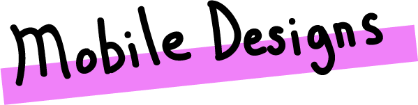
'The Skeptic' also has mobile layouts for its homepage and general story pages to account for an increasing user preference for reading news on their mobile devices.
With an increase in users accessing news through mobile devices especially during their commuting hours creating an responsive layout for 'The Skeptic' general news stories was essential.
With an increase in users accessing news through mobile devices especially during their commuting hours creating an responsive layout for 'The Skeptic' general news stories was essential.
By redefining the goal of online news publications to create informed readers, I believe we will head towards a world that elects leaders founded on acceptance, equality, and the truth.
'The Skeptic' aims to create informed readers by providing them with a reliable platform they can use as a tool to understand what is truly happening in the world.
'The Skeptic' aims to create informed readers by providing them with a reliable platform they can use as a tool to understand what is truly happening in the world.

Let's strive to be autonomous skeptics, and make an informed vote on November 3rd, 2020.